

Documentary encyclobjects: 05 Design and customization

Earn 10.00 Reward Points by commenting the blog post
Documentary encyclobjects: 05 Design & Customization
Documentary encyclobjects: 05 design and customization we have already commented on a few occasions. The idea that was going around in my head was the magazine Orologi. In that magazine, the protagonist was not the design (by the way, minimal, but super elegant), it was the watches, the images. All the colour, the dynamism, the seduction…, everything was in the images, they were the real protagonists of the magazine. They were images on a blank sheet of paper with clear, professional and suggestive text.
But of course, Orologi only presents watches, encyclobjects.com plays on a bigger field, with more and different objects, more colors, more details, more information and interaction… How to design and present all this content on a continent in an orderly, complete, simple and suggestive way? ¿Simple? I don’t know.
I know that most things are already made up, so observation was my best alternative, so I started snooping through publications (on paper and on the internet) and came to a conclusion that confirmed my suspicions. If the protagonist is the product, the image, the news, let’s leave it all the prominence and only highlight our logo as a brand image.
Logo & Color Palette
Encyclobjects is a made-up acronym. The RAE Dictionary defines acronym: 2. m. A word formed by the union of elements of two or more words, constituted by the beginning of the first and the end of the last, or frequently, by other combinations. The fact is that it “sounds” like an encyclopedia of objects, which is exactly what you want to convey. What happens, which in the end, is “what happens to me”, is that I like complications and, in English, it seemed more international to me.
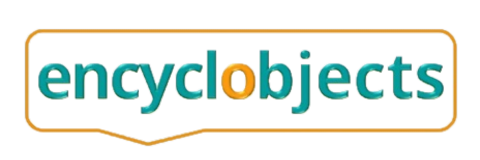
As the domain is encyclobjects.com, for the logo I thought it was appropriate to continue with the name encyclobjects, since it is, first, about ratifying the acronym (encyclopedia of objects), and second, making encyclobjects sound like a short and easy to remember word with the sum of words encyclopedia + objects. This way I avoided searching for an object, or other image/shape/icon that evoked an encyclopedia of objects.
The nexus, the o, divides the acronym into 2 parts with the same number of letters (encycl or bjects), curious isn’t it? For the logo I would have to look for something unique for that letter “o”. At first I thought of [encyclorbjects], and then searching, searching… (logically in royalty-free images), I found an orange billiard ball with a power symbol on it. With a few tweaks I put it in the center, a little bigger “et voilà”, the logo created.
For the Favicon (thumbnail of the logo that appears in browser tabs), I removed the text leaving only the brackets that wrap around the billiard ball with the power symbol. In this way, the digital nature of the magazine was further emphasized.
With the logo already designed, I decided on a more intense color palette for the header, very marked by the navy blue color that would be the background of the main menu and the logo. And another basically neutral color palette for content, menus, and statements. This second palette has had very slight modifications (some transparencies) compared to the one that comes standard in Extra (it is very difficult to improve the unbeatable).
Here is the coding of the color palettes:
– Header: Purple: rgba(92,6,186,0.76), Navy blue: #070f6b, orange Logo: #fe702e, Orange Submenu: rgba(247,131,0,0.93), Green Logo: #2a8e7a, White Text & Menus: rgba(255,255,255,0,6), White Link Text & Menus: #ffffff
– Content: Background: rgba(201,192,237,0), Fixed navigation text: rgba(255,255,255,0.6), Fixed navigation link: #ffffff, Fixed navigation background: #3e5062, Text: rgba(5,5,5,0.6), Text link: rgba(239,83,4,0.78), Header text: rgba(0,0,0,0.75), Accent color: #00a8ff
Footer: Text: rgba (255,255,255,0.6), Header text: rgba(255,255,255,0.6), Text link: #ffffff, bottom bar background: rgba(0,0,0,0.3).
Theme Customization
Extra, by Elegant Themes, is a 100% customizable template. In the WordPress menu is located the basic menu of Extra, in it is the Theme Customizer. In full screen, the home page and the customizer menu will appear on the left. The adjustments you make will appear immediately on the selected page, making it easier to check the result of the adjustment. If the setting is correct, you can save it with the Publish button.
In addition, at the bottom of the menu we have 3 types of visualization: desktop, tablet and mobile. You can also hide the menu to see your website in full screen. All the adjustments we can make are ordered as follows:
– General Settings: Layout, Typography, Background Settings.
– Header & Navigation Settings: Header Format, Main Menu Bar, Secondary Menu Bar, Fixed Navigation Settings, Header Element Settings.
– Footer settings: Layout, Typography, Footer elements, Bottom bar.
– Buttons: Button styles, Button styles on hover.
– Social networks: Inclusion of the URLs of each incorporated social network.
– Site Identity: Site Title, Tagline, and Icon (Favicon)
– Accessibility (Optional): One Click Accessibility icon settings and styles
– Background image: If you want a background image you can place it, resize, etc…
– Menus: You can set up and manage menus in 3 locations, display menus in 3 locations, and you can set up multiple menus.
– Widgets: Depending on the columns in the footer and whether or not you choose sidebars, you can set up different widgets in various locations.
– Homepage settings: Latest posts, static page, or Extra layout. For entry, you can select a page.
– The Events Calendar (Optional): Settings for the different views of events, their categories, and the calendar.
– Woocommerce (Optional): Once you install the Woocommerce plugin, you can customize some Woocommerce features to include with the Extra design.
– Additional CSS: In addition to Extra’s own settings, you’ll be able to add styles of your own by adding additional CSS to the theme.
This is the visual part of customizing the Elegant Themes Extra theme, but you haven’t stopped fully customizing and tweaking the theme. To set up Extra well, it is essential to follow the documentation provided by Elegant Themes.
Creation of pages, entries and menus.
For WordPress, everything is posts, and although it establishes differences between posts, pages, events and projects, at the engine level, they are the same. On the other hand, and to get fully into the subject, one of the features of WordPress is the possibility to get to a site by different paths. All in search of navigation and to make the visit of users more attractive . In the case of encyclobjects.com, the structure of pages and menus has been made as follows:
– Pages: Spaces dedicated to: Home page, legal information, company information, interaction (forms), e-commerce (products), navigation, services, utilities and landing.
- Homepage: Front page.
- Legal Information: Legal Notice, Terms & Conditions, Privacy (EU), Privacy (UK), Cookie Policy (EU), Cookie Policy (UK), Liability.
- Company Information: About Us, Idea , Method, Content, Quality Policy, Tickets, Protagonists, Authors, Events, Projects, Activity, Affiliation, Testbed, e-commerce, Email marketing, Advertising, Social Networks.
- Interaction: Contact, Login, User Registration, Profile, Change Password, Lost Password.
- e-commerce: Store (product pages), My account, Wishlist, Cart, Checkout.
- Navigation: Site map.
- Services: Subscription Plans, Points Program, Shipping, Returns & Refunds.
- Utilities: Frequently Asked Questions, Enlads, Utility Files
- Landing pages: Welcome to the newsletter
– Tickets: Spaces for publications: Articles with images and text, Podcasts and Videos. They are always placed in containers, for example a page, a category, a tag, or a selection, etc…)
– Events: Spaces intended for the presentation and promotion of events. They place either in the Events Calendar (Events page), in a selection of dates, in a category , or in a tag.
– Products: These are spaces that present a file of an item for sale, either directly or by affiliation. They are located on the Store page, in product categories, or in product tags. They also appear on search pages.
– Projects: Spaces for the presentation of projects. They place well in categories or project skills .
As you can see, a site with the characteristics of encyclobjects.com requires many pages, and ordering them well is essential to facilitate a smooth and easy navigation for our users. To offer a good navigation, we have prepared 4 menus that we have located in 5 areas and we detail them as follows:
- Main menu: Located in the header with the Navy blue background.
- Secondary menu: Located in the header (Hamburger Menu) with the Violet background. Second location in footer with the name Company.
- Footer Menu: Located below the Marengo Grey background footer.
- Customer Area Menu: Located in the footer with the name Customer Zone.
An important detail to point out is, and always has to be a goal for any content creator, is to continuously suggest our users to log in every time they visit our communication spaces. In the case of encyclobjects.com, in addition to earning reward points, interaction saves time and improves the browsing experience. Now, how does a user know they’re logged in? In our case, we have used code so that, once the user is connected, the word Access in the main menu is transformed into their username.
Divi Builder
WordPress has a before and after Divi Builder, the most used visual builder in the creation and design of web spaces. If, from the beginning, WordPress was a software that could be used by people without programming knowledge, since the emergence of Divi templates , and the subsequent presentation of the Divi Builder, designing web pages with WordPress is even easier.
Divi Builder is here to help. It can be used to further customize the Extra template (or any other Divi template), and turn a web space into anything imaginable without any programming knowledge!
WordPress content using Divi Builder is structured into sections, rows, and modules.
- Sections: in Blue, they contain a complete unit (page, entry, etc…) or a partial unit. They have individual settings (content, layout, and advanced) and contain rows.
- Rows: in Green, horizontal, they can contain 1,2,3, 4 or more columns, of the same size or different. It also has individual settings (content, layout and advanced) and, in turn, each column can contain one or more modules, which are the tools that contain the functions.
- Modules: in Charcoal Grey: These are the functional containers where the contents are located. There are modules (Short Announcement, Audio, Button, Search Engine, Carousel, Gallery, Image, Menu, Subscription, Text, Video, etc… up to more than 40 functionalities) There are also Woocommerce modules. Each module has its own individual settings (content, design and advanced)
Sections, rows, and modules all have editing tools that allow you to save to the library, copy, paste, deactivate, and even generate content using artificial intelligence. These features allow us to save a lot of time on repetition tasks.
Due to its enormous design, adjustment, and editing possibilities, it is convenient to study the Divi Builder documentation and even view tutorials. Learning is fast, as it is a very intuitive tool and combined with the visual nature of its application, the first results are obtained quickly.
Extra, the Elegant Themes magazine template also has a Category Builder, smaller than Divi Builder but very practical to quickly configure and design the categories of your WordPress.