






Tina Koyama, deep and beautiful signage

Earn 10.00 Reward Points by commenting the blog post
Tina Koyama, introduction
I got to know this design by Tina Koyama by taking a look at the interesting website Behance.net, site or social network of creators owned by the Adobe group.
This signage project was carried out in 2011 for the Hottingen Retreat Centre (Nursing Home), Zurich, Switzerland, and involved the collaboration of Aline Dallo, Julia Kind, Kathrin Urban and Tina Koyama – Stäheli.
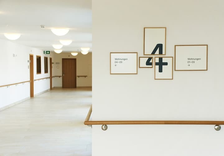
The idea was to suggest a home atmosphere in the residence. For this purpose, 7 sizes of paintings framed in oak wood were selected. For visitors , the largest typographic size would be established (it favors reading and localization). For residents, the smallest type would be determined. The number is in several squares, but its visualization is perfect, causing some surprise and curiosity to visitors to the residence.
This design is, in addition to being original, a kind of game, since it turns something that is normally anodyne into art.
Price: Consult.
Information
Description
A simple oak wood frame in 7 different sizes is responsible for this visually appealing interior signage system. The idea is to create warmth, curiosity and fantasy in an element that is normally nondescript. The internal signage of a building (Hospital, Residence, Offices, etc…) does not usually contribute much, as it is usually solved with widely used elements.
This case is special, in this design, ingenuity has been used to provoke the visitor. The numbers of the floors jump from frame to frame causing immediate visual interest, thus achieving the objective of placing the visitor on the correct floor. This prominence of the number does not overshadow the rest of the information, which, when used rationally, fulfills its mission perfectly.
Technical Data Sheet
- Material: oak wood frames.
- Support: white DIN A3 cardboard.
- Dimensions: 7 different sizes.
Feedback
One of the most brilliant conceptual realizations I’ve come across in the world of signage. Made in 2011, I think it maintains its meaning very high today and will surely serve as an inspiration for designers around the world.
Designer: Tina Koyama, San Mateo, CA – USA https://swissjapanese.com
- Terms and conditions: n/n.
- Privacy: s/n.
- Frequently asked questions: n/n.
- Taxes: : s/n.
- Warranty: s/n.
- Spare parts and repairs service: s/n.
Delivery time: s/n.
Shipments: s/n.
Deferred payment: s/n.
Contact: s/n.
Little else is known about Tina Koyama other than her birth and early life in Switzerland. He also lived in Japan where he developed signaling systems among others. There is not much more about his collaborators in this project either, the websites consulted offer negative results and those that lead to a specific site do not show any of the work that goes into this article, so I have not insisted further on the search.
I don’t have more information, although, as usual with me, I’ve left some alarms that can warn me of their future projects. If they occur, I will tell you. 🙂
Additional Images

Floor 0. Design: Tina Koyama. Image: Behance.

Floor 1. Design: Tina Koyama. Image: Behance.

Floor 2. Design: Tina Koyama. Image: Behance.

Floor 3. Design: Tina Koyama. Image: Behance.
NOTE: If you liked this article, you can share it on social media. You can also rate it with stars below. If you wish to leave a comment, ask a question or make any suggestion you can do so in the comment box below. Thank you for your attention!
Bibliography and media
We use our own and other means with the availability allowed by current legislation and free access to the World Wide Web. (See Terms Conditions)
Texts: Owned, based on information from Behance.
Images: Behance, Retail Design Blog.
Videos: s/n.